

Contents
Tired of reading through pages of numbers? We know the feeling. TimeClick’s dashboard reports are here to make your data analysis that much easier.
How to Run TimeClick Dashboard Reports
To run a TimeClick dashboard report, first open TimeClick and navigate to Admin Options > Dashboard > Dashboard Reports. From there, choose the type of report you want to run and select the date range you want to run the report for on the right-hand side of the screen.
You can choose whether to include all your employees on the report or select a specific employee, a department, or a job category. Then click “Generate Report”. A colorful display of the data for that period will then appear for you to view, evaluate, and even print from PDF format*.
*All dashboard reports are viewable in PDF format except for the Overtime report.
Types of Dashboard Reports
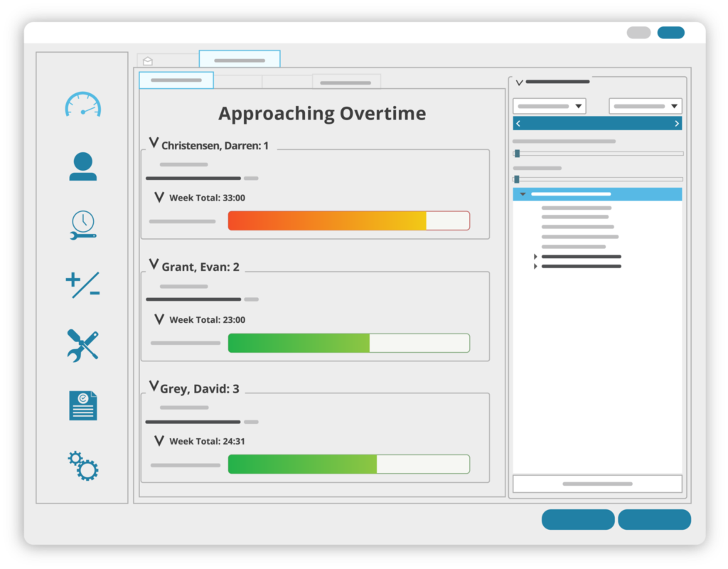
Overtime
If you need a quick view of which employees are close to hitting overtime for the week, this report is for you. The overtime report shows the total number of hours worked by each individual employee as well as how many hours they have left until they hit overtime.
It’s incredibly easy to see who is close to reaching overtime in just a quick glance. This is due to the colorful data bars which change from green to red as your employees get closer to approaching overtime.
If your overtime threshold is not correct in this dashboard report, you can change your settings in Admin Options > Preferences > Pay Period and OT.
Punctuality
TimeClick’s punctuality report is based off of the employee clock schedule. It contains a pie chart, showing the percentages of clock ins and outs that are on time, early, or late. It’s the perfect way to see how often your employees are there without having to look through all the numbers.
This report’s color scheme, size, and other display options can be changed to make your analyzing experience even better.
To change your employee schedules, navigate to Admin Options > Employees > Edit Employee Record > Clock Schedule.
Attendance
The attendance report is similar to the punctuality report. It includes a pie chart of the percentages that employees were present, absent, or using paid time off. If you’re wondering how often employees are missing work, this is the report to see.
Like the punctuality report, you can change the chart theme and other visual settings to make it easier to view.
Payroll Projection
Lastly, the payroll projection report is based off of the pay rate you specify for all your employees. It contains a bar graph with the expected amount your employees should be paid within the pay period.
Just like the previous two reports, you can also change the color theme and other variables in this report.
To change the pay rate of an employee, go to Admin Options > Employees > Edit Employee Record > Detailed Info > Payroll Info. You can also specify a departmental or job code pay rate by going to Admin Options > Employees > Edit Department/Edit Job Codes.
Final Comments
If you have any questions about how TimeClick dashboard reports work or about any other features, feel free to contact our support team at (435) 753-4102 or support@timeclick.com.